Showing posts with label illustration. Show all posts

Saturday, July 9, 2011

Pretty [dark] Colors

Here's the second installment of my poster series where I take a color from the Pretty Colors tumblr and make a poster out of it. The color is #b4ffd7. The title is "Beached Whale."

Photobucket

And here's a detail shot.

Photobucket

Wednesday, July 6, 2011

Pretty [dark] Colors

Yo Yo
I'm tired of staring at a computer monitor so imma make this quick. One of my favorite tumblrs is Pretty Colors. It's runs on a simple formula: post a pretty color and give the hex code for it. It's original which is a welcome departure from the oft-incestual nature of tumblr.

Anyway, the colors are really nice so I thought it would be cool to put a dark spin on it. So I will do my best to make a cute, but dark character using the color as my palette. Like fucked up little flash cards! I made a typeface out of parts of a circle to put the titles in, to keep the juxtaposition-theme going. And as always, I won't spend more than an hour on any of em.

This one is #00ADE6. Or death. Whichever you prefer.

Photobucket

I'll do more and post em soon.

Tuesday, May 10, 2011

Workzilla

These next few days of work are going to be rough. Got a lot of stuff due on Thursday. So I made this quick poster last night to psyche myself up for it.


OhYeahImBack

Monday, April 12, 2010

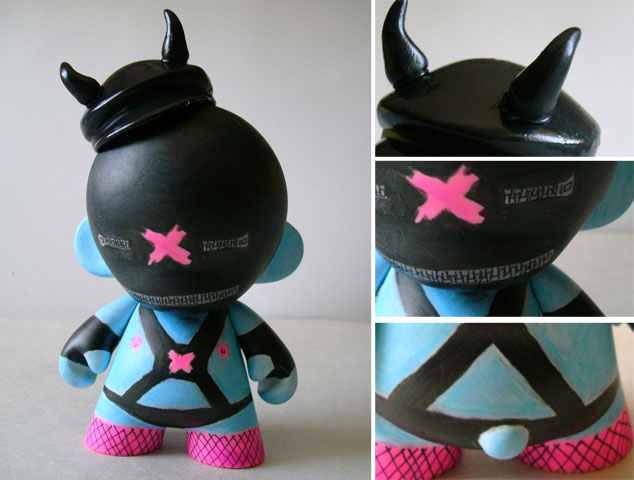
Daily Hat (tri)Weekly Munny

Yo YO!
So the whole Daily Hat Weekly Munny Thing didn't quite work out, but no worries! In it's place is the ever-triumphant Daily Hat (tri)Weekly Munny!

Let me say that I love these little things, they only cost $10 and they provide at least $12 of excitement and fun. This little guy came with a funny motoring hat, so of course I added horns and turned him into a gimp! His name is Blue Gimpy. The marker that came with him was black. It took longer than it should have to make this dude because the markers I was using wouldn't dry! So I had to break for at least 30 min in between applying colors. I think I am going to paint the next one because I am tired of messing with these lame markers.

I've gotten one good idea for the second guy (with the pinwheel), but there has only been one comment so far. You guys don't have ideas? No need to be wary or scared it's just a blog!

Side Note: I have a pink axe murderer and a blue gimp, it seems my ideas are a little twisted! Help me out!

Enjoy.


Thursday, April 1, 2010

New Pornographers

The next poster to be redesigned was this one for the New Pornographers.
Pretty meh, right? I think so too. Listening to their music while I sketched, I kept getting this old school feel. So I went to my book of old 60's advertisements (great for old school images). After flipping through it for a while (the book is like 1200 pages or something), I found this tiny image of 3 girls looking at their butts (it was an old wrangler jeans ad). Once I had my image, I sketched what what I wanted.
Unlike the other posters, I did most of this outside of the computer. I could have faked the torn paper, but there is something about the imperfection and randomness of the real thing that is impossible to replicate on the comp. Anyway, I'm pretty happy with the result.
I wanted to take a small image, blow it up and reveal the details within.

Up next is this Black Keys poster.

Wednesday, March 31, 2010

Ting Tings Remake

My second firedrill was to remake this poster for the Ting Tings.

This is another band that I have heard about, yet never listened to. So I put in an album while I worked. It was noisy and in your face vocals with a steady beat to keep the pace. The general noise created was jarring. The first thing that came to mind was soundwaves.
I took my sketches to the computer and came up with this.
The character in the middle is a collage of a red and pink radio that represents the 2 members, while the oversized lips give it that "pop" feel that I got from the music. The soundwaves would be screened over the photocollage.

Next I remade this poster for The New Pornographers. Check back tomorrow for it!

Tuesday, March 30, 2010

Poster Redesign Fire Drill

Hey YAWL
I think that school has ruined the laziness that I have so treasured throughout my life. I was sitting at home the other day, doing nothing in particular. You know, lounging around and watching TV (daytime network TV but that is a completely different story). Suddenly, I felt this compelling urge to get up and do some work. QUE? I tried to fight it, but alas, I could not. Instead I decided to do a little firedrill.

For those of you who do not recognize the term, a firedrill refers to a creative exercise that is completed in a short amount of time (in this case 3 hours).

So I went onto Gigposters.com (sweet poster site BTW) and began to browse through the random poster section. I chose 2 posters for two different bands and gave myself 3 hours each to redesign them.

The first poster I chose was this one for Vampire Weekend.
Never having listened to too much of their music, I put in their self-titled release and began to sketch. Choppy and energetic, their music made me think about enjoying a hotdog and lemonade while watching a space shuttle launch.
I took my sketch to the computer, found a suitable image, modified it (we don't use stock images, no sir!), and finished my design.
The photo would be printed out and then the green balloon, white lines and type would be screen-printed onto the image. The green would be left semi-transparent while the white would be opaque.


Total time: less than 3 hours
Next I remade this Ting Tings poster.

I'll post the results tomorrow. See ya then!

Friday, March 19, 2010

Daily Hat Weekly Munny

So break is here and I am already back to work (sort of). What I mean is that while I have several projects that I am trying to undertake over the break, I will not be nearly as busy as I am while school is in session.

Anyway, yesterday I was at Sam Flax (art supply store for those who don't know), and by the register they had a bunch of Mini Munnys (Munnies?). Munny is a little blank toy that you can design yourself FYI (there are a bunch of examples here). The ones I am talking about are 4 inches tall.

So I thought it could be a cool little exercise to do one of these each week while I am on break (3 total). To make it a little more fun I decided on a few more rules.

1. Must use the marker that comes with the toy in the color palette
2. Character should be derived from the random accessory that accompanies it
3. Must be started and finished in the span of 24 hours.

So my first one came with a pink marker and a hatchet as the accessory. So I decided that he would be a cute little axe-murderer.

(The pictures were taken with my blackberry, which is why the quality sucks, so don't hate)

Be sure to check back next week for the newest installment of Daily Hat Weekly Munny!


Wednesday, March 10, 2010

Finish Line is in Sight!

Hey Everyone,
Yeah so it's been a little over a week since my last entry. Sorry about that, but no worries, I have something to show you guys that I hope you will find both cool and sweet! This is a watercolor that I did for a class. It is supposed to have a b-movie feel to it. I will post the completed project when it is finished. Until then, I bid you adieu!

Tuesday, December 8, 2009

Quick Update

YO, YO, YO! SUP, SUP, SUP?

This will probably be my last update until this qtr is over (next Tuesday around 10pm), so I am gonna try and give you guys a few things to chew on.

First, I thought I would let you guys know that the Hohner ads that I put up about a month or so ago won a few awards at school, one of them being student choice for art direction. I did pretty well, I won 4 awards in three different categories (Advertising, Art Direction, Illustration, Design). That isn't good enough, though, I am gonna go balls out next quarter and hopefully get some good news to share with the unwashed internet masses (is that smell me?).

Next, I got an update on the dummies illustrations on the post right below this one. If you recall they are for my publications class. Here is the watercolored version of them.

Next, I have some cool retro comics that I drew for your viewing pleasure. They are for my brand extensions class. The lines were written by Jeff Scardino, the strapping Italian fellow responsible for the Hohner ad copy. I will reveal later what context these fit into; for now just enjoy them for what they are (random-as-shit).


Hmmmm, I am sitting here trying to think of some other stuff I can show you. Oh yeah! I got some type portraits of Dave Eggers that I did for my publications class. You wanna see em?

::waits::

OK! These are for a feature article I did where readers got to ask Eggers questions. The portraits are made up of all the questions that are asked in the article (yes, the article does exist and no, I did not write it nor did I speak to Eggers).


Ok, well that is a decent amount of original stuff, so how about an embarrassing little factoid about yours truly? Here it goes: I got the new Shakira CD and I think it is awesome. The video for She Wolf is great too. I know, I was surprised too, but I can't help the way I feel. Anyway, check it out. At the very least it will force you to re-evaluate what you think about me.

Phew! That quick update turned into one of the longest posts I've done in a while. Cool. See ya.


Wednesday, December 2, 2009

Dummies!

YO! Final 2 weeks of this quarter means a few things: less sleep, more Red Bull (it's an inverse relationship), lots of work getting done, and that the break is coming soon! Here are some little guys that I drew for a magazine spread I am working on. I call 'em dummies. Will post final spread when I finish it.

Oh yeah, leave some comments. I mean, if you want to. *nudge, nudge* You don't have to...but it'd be cool if you did.

Wednesday, September 16, 2009

HI!!!

I hope there are still a few people that check the hat for updates. I know I haven't updated in about 3 week (geez!), and I'm going to blame it all on school. Well, school is over (for now) and I have a TON of stuff that I am planning on putting up here in the next few days so LOOK OUT! I've got a pretty wide range of stuff that I am going to post, from simple illustrations to packaging, to and entire branded campaign. So keep your eyes peeled (that saying is disgustin btw) and your face intact, because hopefully my sweet ass design skills will melt it off! Wishful thinking probably, but you never know.

These are illustrations I did for an art director at school. They are for a company called "One Laptop One Child" that gives poor children in africa laptops so they can get on the internets and waste time like you and I. Okay, they probably give them laptops for educational purposes. Anyhow the ads came out really well and props to Lauren Boyd and Michael Williams for the art director and copy(respectively). I hope you like them!


I love character design and had a lot of fun doing these. So if anyone needs any illustrations, holler at me!

Saturday, August 15, 2009

Brian Eno & David Byrne poster

One of the assignments in my illustration class is to make a poster. It could really be about anything, but I chose to do a concert poster for Brian Eno & David Byrne. If you don't know who these guys are click here. It isn't quite done (probably about 85%), but I thought that I would put a little preview.

I used a special technique for this poster, as we were only allowed 3 colors (with black counting as a color). My 3: orange, blue, and black. In order to get more colors, I decided to use a dot matrix overlay technique (I doubt I am the first to do this but I did come up with it independently). Basically I used squares composed of different densities of dots to get multiple values out of each color. When I overlay and print the different colors on top of each other,new colors (like the brown in the bear which is the blue and orange) are created. I tiled the squares over my image and got rid of the excess dots until I had achieved the desired shape. Pretty cool stuff.

This process also gives a modern shout-out to old letterpress printing styles and screen printing. I like old school.

Check out my bear:


Friday, July 31, 2009

JAH!

So I am going to try and post more often. This does not, however, mean that the quality of my posts (or lack thereof) is going to decline (or improve?). It just means that I am going to be working a little harder. I think that I have struck a pretty good balance of original content, random web-finds, and opinion posts. This means that the type of content will not change, but the amount of it will increase. All of this at no charge to you! I mean, what a deal, right?

Below is a pencil drawing of Bob Marley that I did a while back. It probably took about 6 hours to complete (give or take). Enjoy.

Monday, July 20, 2009

Typecon 2009

Yesterday concluded my 1 week long adventure at Typecon 2009, and boy, are my stems tired!* I learned a lot about type, listened to a bunch of important typophiles and designers speak, and even met a few of them! Oh yeah, not to mention all the free stuff I got! I learned a few things this week:

  1. I love typography, but not necessarily typeface design— I just do not have the patience for it.
  2. I want a letterpress— old skool craft that yields amazing results!
  3. Learning CSS and HTML is integral— gotta stay ahead of the curve.
  4. My computer is a noisy mess— okay, I already knew this (:P).

So, to commemorate my type-journey, I am going to share some self portraits that I made out of type. One is hand-drawn and one is a vector illustration. ENJOY!


*Man, type jokes are so lame that they are awesome! Wanna hear another one? OKAY!

I made this one up myself:
What did the kinky type designer get his wife to do to his penis?


He letterpress it! (DRUMS)

Thursday, July 2, 2009

little buddy


Toof is a demented little tooth-fairy-esque character who preaches good dental hygiene and mayhem. He has a crew of evil bunnies that help him with his nefarious deeds. I would love to eventually sculpt this little guy (and his friends)!