peace!

Friday, October 22, 2010
Blog on Haitus
Not that anyone reads this but the blog is going on haitus for a little while. Super-improved 2.0 version to be released and some point in the future (hopefully near).
Wednesday, September 1, 2010

Monday, August 30, 2010
The Most Interesting Cobra in the World
This is the story of the most badass reptile that has ever lived. He is the summit of masculinity and his cold-blooded heart will give any warm-blooded honeydip hot pants. Eventually he will be a t-shirt design or something, maybe a patch.
A little backstory:
I was in a meeting and we were discussing opposites. It's not really important why. For instance, someone is either a salad eater or a buffet buster. A nice guy or an asshole. An elephant or a mouse. We were trying to decide what the opposite of "shy" would be when one of my coworkers immediately shouts out "stunt cobra!"
"Sure...wait what!?" I respond.
"Stunt cobra" he says, very matter-of-factly.
I bust out laughing at the absurd sincerity in this response.
Later, in another meeting, I began to imagine what this studly reptile would look like. As a goof, I showed it to the guys from the earlier meeting. They loved it, and I was rewarded with some of that sought-after attention that I crave.
 Version one of Stunt Cobra
While I liked S.C. 1.0, I concluded that he was too awkward and needed an image overhaul. He was a little too Michael Cera and not enough Mario Van Peebles (more opposites).
 Prancing Cera has no effect on Moto-Peebles, who continues his journey on the highway to ladies' hearts.
 Prancing Cera has no effect on Moto-Peebles, who continues his journey on the highway to ladies' hearts.
I returned to my sketchbook and a few minutes later the preliminary sketch for S.C. 2.0 was born in all its Patriotism-draped-in-leather glory.
 S.C 2.0 ready to whoop some ass.
Keep on the lookout for S.C. on the 'hat in the near future!
Sunday, August 29, 2010
Things I miss about school/atlanta (and some that I don't)
Things I miss
1) The freedom to choose my client
2) The freedom to decide what executions I think fit the project
3) All of my friends (gf especially)
4) Waking up @ 9am
5) Fun late night work sessions (key word is "fun")
6) Carefree-ness (the ability to say "fuck it" about a project)
7) NO BUDGETS!
8) southern fried goodness
Things I don't miss
1) Listening to a bunch of people present before me (I know this may sound dickish, but, no, your idea isn't that good and I am tired of hearing about it)
2) Paying for dinner when I work late
3) Poorness (I am by no means rich, though)
4) Jabronis (you know who you are....well, maybe not)
5) Driving everywhere/parking (not having a car is awesome)
6) Being under my parents' thumbs
 A recent photo of this post's author hard at work
Saturday, July 24, 2010
Wandering around
YO!
I've been here for 2 weeks now, and I gotta say it's pretty awesome. Works going good, but that isn't what this post is about. It's about rad stuff that I find while I wander around this crazy city.
 We got a cat. He's part tiger. He likes to have his belly rubbed, so I believe he may also be part dog.
 I like taking pictures of crazy machinery.
 Case in point.
 The San Francisco Chocolate Factory. Pretty sweet mural. I wonder if the food is good?
 This graf was a part of an alleyway full of awesomeness. I will have to go back and document it all for another post.
 PIIHB
PIIHB This record store had a Tron videogame. And...
 A Master P doll. UUUUUUUUUUUHHHH!
See ya!
Monday, July 12, 2010
WELCOME BAAAAAACK!
Hey!
So, if you couldn't tell, you were supposed to sing the title of this post (so if you didn't... give it a try... no worries, I'll wait).
Awww yeah!
Anyway, no more silliness! I wanted to drop a few photos down here to let you guys in on what I'm up to.
As you know, I just started work at AKQA in SF. Today was my first day— actually, today is my first day (I may still be here). Here are some shots:
 Nice view from the train on the ride in.
 No turning back now.
 They got me. View from my desk.
 'AWWW, flowers?! For me?'
 This piñata is my new buddy. I am gonna work on making human friends at some point, as well.
Team Xbox plays madd Halo at the end of the day. I may go down there and get stomped for a while. Eventually, I will get better and begin to crush them. This is my destiny.
*Note that the dust that has accrued in the lens of my camera gives these shots a nice 'vintage' effect. Or maybe it's just a crap camera. IDK
Thursday, June 17, 2010
Onward...
HIYO!
Sorry for the no post, but I have been getting things in order with school, etc.
Quick Announcement:
My school career is officially over. I was slated for one more quarter, but instead I will be moving to San Francisco and starting the next leg of my life as a junior designer at AKQA. I am extremely excited. The Daily Hat is coming with me to the left coast, so continue to check it out every week or so. Gonna grab a nice camera and try my hand at taking some shots. Also, I am about to start illustrating a graphic novel with a copywriter from school, so look out for that, too.
I'll leave you with this video done by none other than AKQA for Nike.
Tuesday, May 25, 2010
Funny-ass Anti-World Cup Ad
This is one of the spots MTV made against the World Cup. I love this kind of humor, so I share it with you!
Wednesday, May 19, 2010
Life without Craftsmanship
From Scholz & Friends for the German Federation of Craftsmen. Craft is something I am constantly trying to improve, so this was doubly awesome. Plus you gotta love videos that reward you for watching the credits (SPOILER ALERT!).
Enjoy
Enjoy
Sunday, May 16, 2010
I'm still alive!
Hey guys sorry for the no-post over the past 2 weeks or so, my life has suddenly gotten very crazy. Just spent the last week in NYC going to all sorts of amazing agencies and showing my work. If you are interested in what my portfolio looks like, jet on over to www.seanpmatthews.com Changes are sure to be made over the next few months as I finish school up.
YOU ROCK!
Saturday, May 1, 2010
Polls are Now Closed!
And it's hipster in a landslide! So expect to see the glorious dude soon. Unfortunately, Hipster was the one choice that I offered, so no one wins any cool prize...
Next time more people should offer ideas so I don't have to fill the remaining spots!
Monday, April 26, 2010
Cool WWF Spot
No, not the Wrestling Federation, the wildlife one. This is more like a really short film rather than an ad. I like the story it tells and the makeup is badassssssss.
Enjoy.
Space Monkey from Leo Burnett on Vimeo.
Wednesday, April 21, 2010
A Collaboration of Blog-Like Proportions
This is the first of many collaborations between the Daily Hat and Captain's Blog. Today, we reviewed KFC's new sandwich, the Double Down. You may have heard of it. It is 2 pieces of fired chicken with bacon, cheese, and sauce in the middle.
I tried it too, and I must say, that it was quite tasty. The only downside is the food coma that it puts you in afterwards (I'm still recovering). This quote from Captain's Blog says it better than I ever could
Double Down or Bust from Sean Matthews on Vimeo.
I tried it too, and I must say, that it was quite tasty. The only downside is the food coma that it puts you in afterwards (I'm still recovering). This quote from Captain's Blog says it better than I ever could
The "sandwich" is damn tasty indeed. But be warned, it is deadly. I would go so far as to say that the Double Down is not fit for weekdays, or anytime where any sort of prolonged productivity will be required after consumption.
Stay tuned for more inter-blog collaborations, and don't forget to vote on the poll!
Help The Munny Find Himself
There is a poll in the upper right-hand corner of the blog. Basically I am gonna let you guys choose what I do to the next munny. He desperately needs your help. So vote... or he dies!

update: After only a single day, Hipster is in the lead! Polls are open for another 9 days, and the record-breaking voter turnout has the Daily Hat optimistic that this race is far from over.
Monday, April 12, 2010
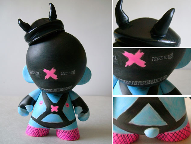
Daily Hat (tri)Weekly Munny
Yo YO!
So the whole Daily Hat Weekly Munny Thing didn't quite work out, but no worries! In it's place is the ever-triumphant Daily Hat (tri)Weekly Munny!
Let me say that I love these little things, they only cost $10 and they provide at least $12 of excitement and fun. This little guy came with a funny motoring hat, so of course I added horns and turned him into a gimp! His name is Blue Gimpy. The marker that came with him was black. It took longer than it should have to make this dude because the markers I was using wouldn't dry! So I had to break for at least 30 min in between applying colors. I think I am going to paint the next one because I am tired of messing with these lame markers.
I've gotten one good idea for the second guy (with the pinwheel), but there has only been one comment so far. You guys don't have ideas? No need to be wary or scared it's just a blog!
Side Note: I have a pink axe murderer and a blue gimp, it seems my ideas are a little twisted! Help me out!
Enjoy.
Wednesday, April 7, 2010
Munny Update
I have been asked by a few people why I didn't make good on my Weekly Munny promise. Short answer: I'm a liar. Long answer: I got caught up doing all these posters and never found the time to go buy the 2 other Munnies. Well, today I went and picked them up so expect to see them soon. Along with the next poster. School is pretty hectic (already!) but I will find time for those of you who find the time to read this blog. It's like a little promise!
Here are the Munnies. I have an idea already for one of them but the other I am still kicking around in my head. What would you do with the one with the pinwheel? It came with a red marker.
 If you got a good idea, maybe I'll use it. Then I suppose some sort of reward would be in order, wouldn't it??
Monday, April 5, 2010
Back to School
Well the break came and went. At times it felt like time was moving incredibly slowly, yet in hindsight it seems like I was barely on break at all.
Funny thing about time is that if I don't do anything, it creeps along slowly. Then after I am done doing nothing, it seems like the time flew by. I suppose it is because when I do nothing there is really not too much to remember. Yet the whole idea gets even more confusing when my schedule is packed. The times where I am constantly moving and busy, time seems to fly by. In hindsight the time seems to have passed just as quickly as when I do nothing. Confusing is an understatement.
Time (at least to me) is a damned if you do, damned if you don't situation. If I pack my day with content, errands, routines and jobs, I will experience the same result (as far as memory is concerned) as I would if I were to do nothing. No matter what, the time will seem to have flown by, and I will eventually forget much of what I did. But I will probably remember that Michael Jordan averaged 37 points-per-game during the 1986-1987 NBA season. Time and memory are crazy mofos, and they seem to work together just to confuse me.
Is there a point to this post? Maybe not, but if you took the time to read it then you will no doubt forget you read it, and the time it took to read it will become a distant memory. But wouldn't it be awesome if the only thing you remembered was Jordans 37 ppg average for the 86-87 NBA season?
I would like to state that this is completely my uninformed opinion. I have never read any books on time and don't understand it that well.
Thursday, April 1, 2010
New Pornographers
The next poster to be redesigned was this one for the New Pornographers.
 Pretty meh, right? I think so too. Listening to their music while I sketched, I kept getting this old school feel. So I went to my book of old 60's advertisements (great for old school images). After flipping through it for a while (the book is like 1200 pages or something), I found this tiny image of 3 girls looking at their butts (it was an old wrangler jeans ad). Once I had my image, I sketched what what I wanted.
 Unlike the other posters, I did most of this outside of the computer. I could have faked the torn paper, but there is something about the imperfection and randomness of the real thing that is impossible to replicate on the comp. Anyway, I'm pretty happy with the result.
 I wanted to take a small image, blow it up and reveal the details within.
Up next is this Black Keys poster.

Wednesday, March 31, 2010
Ting Tings Remake
My second firedrill was to remake this poster for the Ting Tings.
 This is another band that I have heard about, yet never listened to. So I put in an album while I worked. It was noisy and in your face vocals with a steady beat to keep the pace. The general noise created was jarring. The first thing that came to mind was soundwaves.
 I took my sketches to the computer and came up with this.
 The character in the middle is a collage of a red and pink radio that represents the 2 members, while the oversized lips give it that "pop" feel that I got from the music. The soundwaves would be screened over the photocollage.
 Next I remade this poster for The New Pornographers. Check back tomorrow for it!

Tuesday, March 30, 2010
Poster Redesign Fire Drill
Hey YAWL
 Never having listened to too much of their music, I put in their self-titled release and began to sketch. Choppy and energetic, their music made me think about enjoying a hotdog and lemonade while watching a space shuttle launch.
 I took my sketch to the computer, found a suitable image, modified it (we don't use stock images, no sir!), and finished my design.
 The photo would be printed out and then the green balloon, white lines and type would be screen-printed onto the image. The green would be left semi-transparent while the white would be opaque.
 I'll post the results tomorrow. See ya then!
I think that school has ruined the laziness that I have so treasured throughout my life. I was sitting at home the other day, doing nothing in particular. You know, lounging around and watching TV (daytime network TV but that is a completely different story). Suddenly, I felt this compelling urge to get up and do some work. QUE? I tried to fight it, but alas, I could not. Instead I decided to do a little firedrill.
For those of you who do not recognize the term, a firedrill refers to a creative exercise that is completed in a short amount of time (in this case 3 hours).
So I went onto Gigposters.com (sweet poster site BTW) and began to browse through the random poster section. I chose 2 posters for two different bands and gave myself 3 hours each to redesign them.
The first poster I chose was this one for Vampire Weekend.
Never having listened to too much of their music, I put in their self-titled release and began to sketch. Choppy and energetic, their music made me think about enjoying a hotdog and lemonade while watching a space shuttle launch. I took my sketch to the computer, found a suitable image, modified it (we don't use stock images, no sir!), and finished my design.
 The photo would be printed out and then the green balloon, white lines and type would be screen-printed onto the image. The green would be left semi-transparent while the white would be opaque.
Total time: less than 3 hours
 I'll post the results tomorrow. See ya then!
Saturday, March 20, 2010
Typographical X-rays by Vanessa Ruiz
These are great. Excellent details such as the slight blur and the "hot spots" that glow whiter. Great stuff.

Friday, March 19, 2010
Daily Hat Weekly Munny
So break is here and I am already back to work (sort of). What I mean is that while I have several projects that I am trying to undertake over the break, I will not be nearly as busy as I am while school is in session.
Anyway, yesterday I was at Sam Flax (art supply store for those who don't know), and by the register they had a bunch of Mini Munnys (Munnies?). Munny is a little blank toy that you can design yourself FYI (there are a bunch of examples here). The ones I am talking about are 4 inches tall.
So I thought it could be a cool little exercise to do one of these each week while I am on break (3 total). To make it a little more fun I decided on a few more rules.
1. Must use the marker that comes with the toy in the color palette
2. Character should be derived from the random accessory that accompanies it
3. Must be started and finished in the span of 24 hours.
So my first one came with a pink marker and a hatchet as the accessory. So I decided that he would be a cute little axe-murderer.
(The pictures were taken with my blackberry, which is why the quality sucks, so don't hate)
Be sure to check back next week for the newest installment of Daily Hat Weekly Munny!

Wednesday, March 10, 2010
Finish Line is in Sight!
Hey Everyone,
Yeah so it's been a little over a week since my last entry. Sorry about that, but no worries, I have something to show you guys that I hope you will find both cool and sweet! This is a watercolor that I did for a class. It is supposed to have a b-movie feel to it. I will post the completed project when it is finished. Until then, I bid you adieu!

Monday, March 1, 2010
Award Season is Rough
Yo YO!
So it is like 4 in the AM and I have class in a few hours. I realize that I haven't been posting at my usual rate lately but their is good reason for that, and that reason is award season. Basically there are several award shows for the creative industry (that's design and advertising mostly) and these award shows have student categories for people like me to make a name for ourselves. So I have been working my ass off to enter as much stuff as possible while also keeping up with my normal course-load (which coincidentally is at an all time ridiculous high). All of these things translate into less time to post on the blog.
"But, Sean, That sucks ass!"
Yes, yes it does, and for my absence I apologize. I have so much stuff that I could show you guys but, sadly if I did, I would be disqualified from the competitions (can't show anything until judging is over). But I can show you some snippets of what I am doing.
Here is a little illustration I am doing for a poster campaign. I will show you the final product when I am allowed to (along with a shit-ton of other stuff).
Enjoy.

Thursday, February 18, 2010
Banner Retrospective
Hey guys, I hope that you like the new banner. After I put it up, I realized that I should put all the banners I've done together in one post so you could see them all. So here goes.
 Ahh, the first banner. An illustration collage that simultaneously demonstrates the randomness of my characters and my ignorance of standard web banner sizes.*
  The second banner is much cleaner, computer-y, and (dare I say) feminine? This marks my exploration into designing across multiple software platforms (in this case photoshop and illustrator).
  "Get Some" is the first of many experiments that I did with optical illusions. It eventually grew into a cover I did for my publications class.
  The forgotten mascot of the Daily Hat starred in this banner that also draws influence from kitschy 60's design patterns. I don't think he is dead quite yet, merely lying dormant at the bottom of the ocean a la Godzilla.
  Mechanical shark is a testament to the inner workings of the blog itself. Sleek and deadly on the outside, confusing and ripe with whirs and buzzes on the inside. Shiny in both sides. Notice now that I am fully aware of correct banner sizes.
While the evolution of the banner is perhaps not the most interesting material for a post ever conceived, it does feel a bit like those annoying clip shows that sitcoms do when the want to take a week off, I do think that the similarities and differences they exhibit are of some note. Kinda of a mini time capsule of the blog over it's first year of existence. Here is to another successful year. After all, it's all about you guys. Otherwise I am just shouting into the internet, which is pathetic.
*actually this was the second banner. The first banner was only the gentleman with his tongue out and was even more egregiously mis-sized.
Tuesday, February 9, 2010
Ubiquitous Superbowl Ad Post
So I took a break from my work to watch the Superbowl on Sunday, because, well, it's the Superbowl. The Saints won and there is nothing I can do about that. But I am not here to talk about the game, let's talk about the ads. I mean, I should care about this stuff, right?
Let me begin my assessment by stating that I was rather disappointed at the advertisements this year as a whole. There were moments where I chuckled, where I took notice, where I listened. But I cannot recall a single commercial that made me say "Wow, that was really smart." I saw nothing that took a simple idea, executed it simply and powerfully, and summed it up in such a way that left me feeling emotionally moved or introspective. What does a good Superbowl Ad look like to me? Well, this one stands out in my mind:
Regarding ads that use comedy to make their point. I think that, while effective, straight comedy ads can be somewhat of a cop out. Case in point from this year's crop is the Snickers commercial with Betty White and Abe Vigoda. I know a bunch of people really enjoyed this commercial. I, however, thought that it was kind of stupid and a little insulting. I mean all that money and what you came up with was that tackling old people is funny? Oh and they are playing football. In a commercial during the Superbowl. How clever. I am not saying that I am above low brow humor, I really enjoyed this Doritos ad, but give me something to go along with the immature humor and slapstick.
And the Budweiser Kleisdale commercials where they show an animal that wants be in the group, but can't, but then they work hard and become and honorary member and take one glorious ride have to stop. Enough already. I know they probably have market research that says "people like the kleisdale ads" but at least interject some originality into it. Like the spot a few years ago where they were playing football and the zebra was the ref, that was clever.
I will close this post with some quick thoughts. The dodge ad was almost awesome, but I thought the ending was a let down. The doritos ads were funny. The fact that the company that used crowdsourcing had (arguably) the best ads is telling. Snickers (for me) sucked. The movie trailers looked awesome but those people make any movie look awesome (Donnie Darko is the prince of persia?Really?). Tim Tebow ad was dumb, he should have been more opinionated and the fact that he tackled his mom was confusing. I guess he was getting ready for the special teams duties that will be his NFL career. My favorite ad was Doritos Samurai, but I will readily admit that it was stupid, but whoever made that guy's costume deserves a huge round of applause.
Next week I will post my One Show submissions.
Thanks for reading!
Sunday, January 31, 2010
Sunday Sketchbook
HI! It's time for some Sunday Sketchbook. Most of this stuff was pulled from an older sketchbook of mine from last year. So 2009. Enjoy.


Sunday, January 24, 2010
Some inspiration
I found this video on NotCot.org. For my creative-type readers, it will be a cool rehaash of the process that has been pounded into our heads over and over. For my other readers, I hope that it is just cool what this fool did to the sketchbook. Actually, now that I think about it, this process can work for a bunch of types of professions; that means everyone can learn and enjoy! NICE!
Rethink Scholarship at Langara 2010 Call for Entries from Rory O'Sullivan on Vimeo.
Sunday, January 17, 2010
Cool Movie Title Sequences
So I am working on a project in my Color Theory class that has me designing packaging for men's formalwear accessories. You know, cufflinks, money clip, pocket squares, scarves (it is winter after all), bow ties and the like. Anyway, my influence for this project is the late and great Saul Bass, designer extraodinaire! even if you don't know who he is, you have no doubt seen his work. Many of the logos he designed 30-40 years ago are still in use today, such as At&t, United Way, Girl Scouts of America, Kleenex, Exxon, United Airlines, Minolta, Bellsouth, you get the point. Also his title sequences revolutionized the industry and have been the influence of many of todays great film openings.
I thought that I would post some title sequences that I thought were pretty sweet. If you have any favorites, post them in the comments and I will add them to the post!
Saul Bass' title sequence for the Hitchcock film North by Northwest is made all the more incredible because back in the day, all this stuff had to be done by hand and the photographed!!
Love this one for Catch Me if You Can.
I mean, almost all of the James Bond movie intro's are great, but this one is super great!
Se7en, super creepy, super amazing.
You're Favorites
Dead Man on Campus.
True Blood, not a movie, but still cool.
Zombieland. Gotta love zombie movies. RUN!
Saturday, January 16, 2010
Pants on the Ground
Lookin' like a fool with your pants on the ground! Love the dance at the end. Awesome that this guy is from my hometown.
Wednesday, January 13, 2010
Super Effing Sweet!
With the D&AD, One Show, Andy's, Art Directors Club, and Future Lions deadlines all approaching, I thought maybe I would share these kick ass posters with you! The trick to winning in these award shows is to capture the judges attention quickly and get your idea across in a fresh and succinct way. You must always remember that there are thousands of entries, so if you can make yours stand out and be clever, you are pretty much golden (or silver or bronze as the case may be). In the spirit of these award shows, I am not going to say anything about these posters (besides that they kick ass). I will simply step aside and let them do the talking. All props and respect goes to Alexander Nedelev for these intelligent designs.


Subscribe to:
Posts (Atom)